White Cliffs, Silk Seas: A Practical Editing Journey

Today we dive into editing high-contrast seascapes, focusing on preserving white cliff texture while softening water motion. Expect hands-on guidance from RAW to print, shaped by real coastal sessions where spray, glare, and shifting light test patience. We will protect crisp chalk edges, calm restless waves, and keep luminous detail intact through gentle, disciplined choices. Share a coastline you love, and join the conversation about choices that keep landscapes believable.

Field to File: Capturing for Flexibility

Great editing begins before any sliders move. Aim for clean, low-ISO RAW files with stable tripod setup, consistent horizon, and deliberate exposure that preserves cliff highlights. Bracket judiciously, manage spray on filters, and plan compositions that simplify foreground chaos, giving generous latitude for selective softness without sacrificing mineral detail.

Taming Dynamic Range Without Crushing Whites

Begin in a neutral RAW profile to avoid baked-in contrast, then raise exposure thoughtfully while monitoring each channel’s ceiling. Prefer gentle highlight roll-off to aggressive recovery. Preserve micro-gradations inside chalk by balancing exposure blend decisions with subtle tone mapping that respects natural luminosity rather than forcing drama. Share your RAWs and questions below, and let’s compare approaches.

Texture vs Clarity vs Dehaze

Favor Texture for fine pores, reserve Clarity for broader midtone structure, and hold Dehaze for localized mist or glare, not global punch. Mix in restrained sharpening with wide radii to sculpt form, then finish with a tighter pass only where chalk edges genuinely need emphasis.

Frequency Separation for Rock Faces

Separate color and tone shapes from high-frequency detail to dodge and burn form without smearing grit. Paint gently on the low layer to guide light, then restore crispness on the high layer, avoiding halos while protecting the cliff’s authentic, weathered complexity from edge to edge.

Handmade Light: Subtle Dodge and Burn

Use small, low-flow brushes to tease depth along ridges and recesses where sunlight grazes. Alternate between soft light and overlay blends at minimal opacity. The goal is shape, not sheen, preserving chalk’s matte dignity while nudging attention without drawing outlines or artificial sparkle.

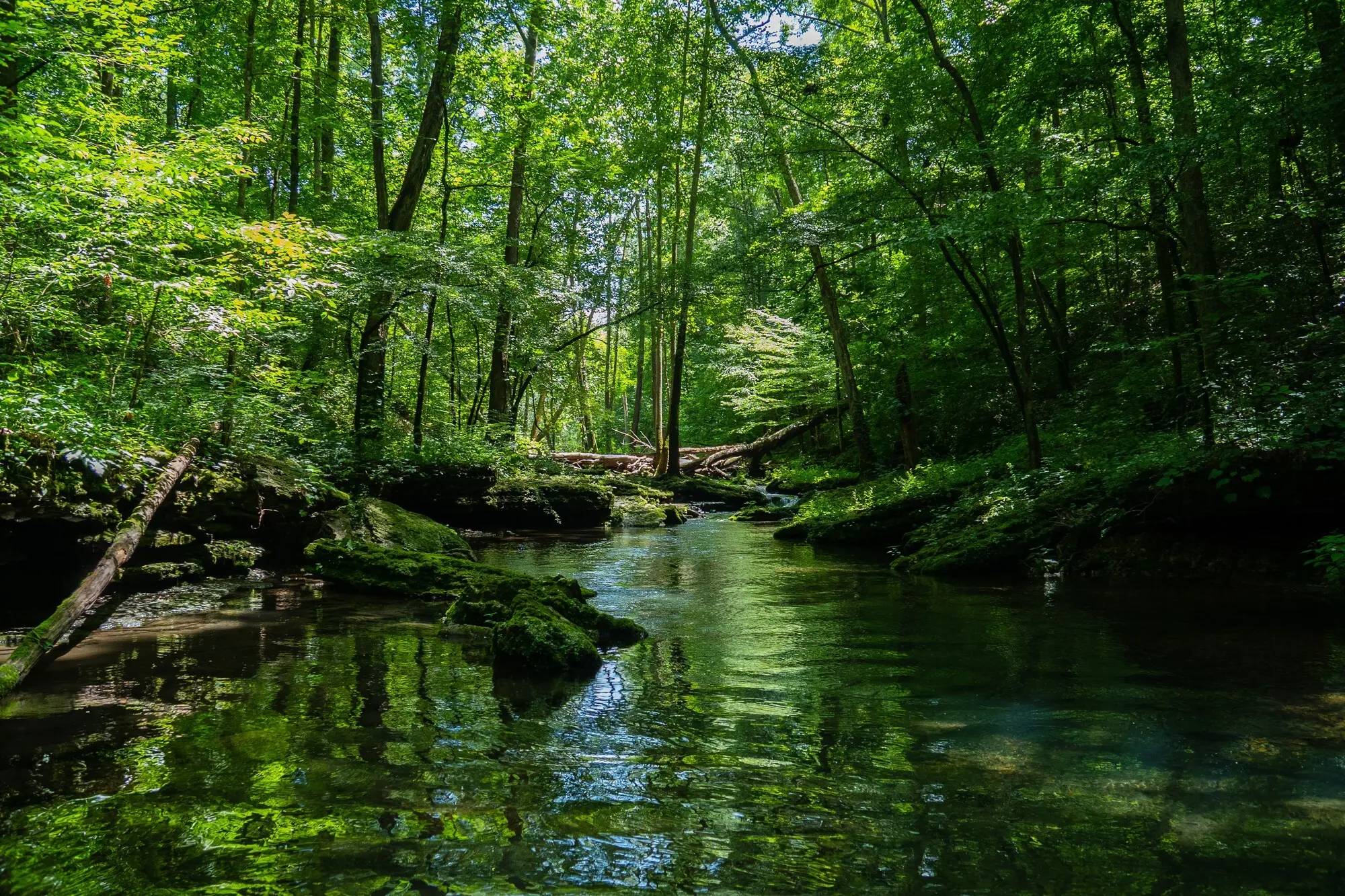
Frame Averaging and Smart Alignments

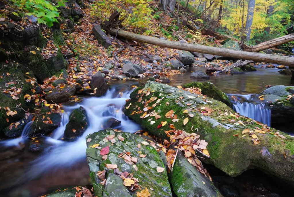
Capture a burst at shorter shutter speeds, align the sequence, and median-stack to melt choppy texture while keeping the cliff rock-solid. Trim frames where waves break disastrously on edges. Subtle blurring across time feels truer than one heavy filter that flattens every ripple equally.

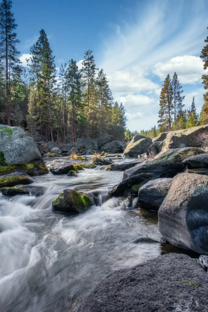
Selective Blur, Protected Edges

Use masks to confine motion effects below the horizon and away from chalk contours. Combine Directional Blur at low strength with a gentle Surface Blur for foam, building softness in layers. Feather thoughtfully so transitions dissolve, never forming halos against the hard, sunlit limestone boundaries.

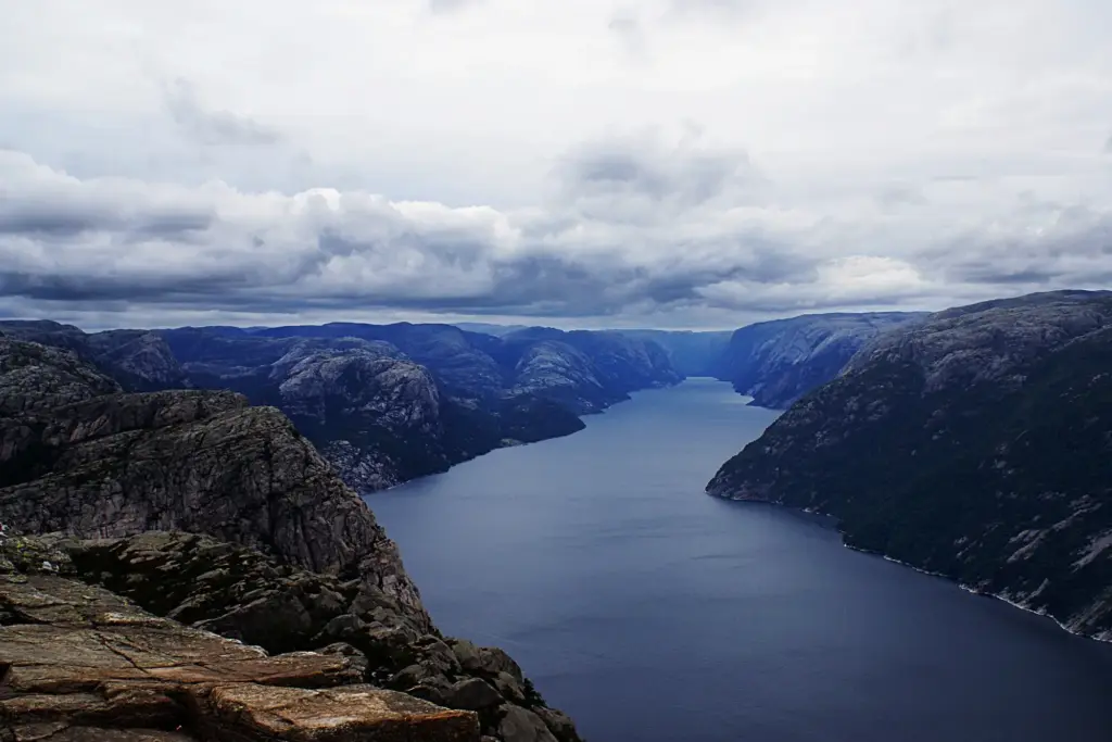
Let Movement Tell a Story

Study how tide pulls diagonally or returns in mirrored sheets. Echo that narrative with blur direction and gradient masks, keeping tonality believable. A whisper of texture in the nearest water anchors scale, helping the serene surface feel expansive rather than unnaturally gelled or overprocessed.

Edge-Aware Painting and Feather Discipline

Paint inside selections made from luminosity or color range tools, then add micro-feathers manually. Too wide, and halos appear; too narrow, and chatter bites into detail. Nudge opacity, build slowly, and flip the canvas to spot bumps your eye has started to ignore.

Match Micro-Contrast Across the Horizon

If cliffs sparkle while the adjacent sea sits flatter than paint, the seam betrays the manipulation. Equalize structure just along the boundary with a small brush, alternating clarity or texture gently on either side so both materials breathe together while remaining distinct in character and purpose.

Color and Light Consistency Checks

Toggle between before and after while squinting, and step away for a minute. If the cliff glow shifts oddly relative to sky, nudge white balance locally. Use soft-proofing to anticipate print stock warmth, avoiding surprises that dull chalk or tint the sea unpleasantly.

Color, Atmosphere, and Honest Mood

A chalk coast breathes cool neutrals with faint warmth in sunstruck planes. Resist cyan-heavy seas and overzealous Dehaze that steals distance. Let moisture and salt hang in the air, then guide attention with subtle grading that respects geology, weather, and the quiet patience of moving water.

Neutral Whites Without Killing Soul

Sample from shaded chalk and set a baseline, then allow tiny shifts where sunlight actually warms the surface. If a global correction feels surgical, try a gentle split grade that keeps whites believable while letting the sea drift cooler, enhancing separation without theatrical exaggeration or plastic sheen.

Haze, Spray, and the Air Between Things

Salt mist softens contrast with poetry. Instead of erasing it, shape it with local Dehaze gradients that respect distance. Add micro-contrast only where forms need articulation. The result feels breathable and dimensional, helping cliffs remain solid while water and sky whisper rather than shout.

Final Sharpening That Honors Stone

Sharpen selectively on the cliff using masks tied to high frequencies, avoiding the water entirely. Choose modest radius to accentuate granular chalk, then output-sharpen according to medium. Paper swallows micro-contrast, so a touch more is welcome, while screens prefer restraint to prevent crunchy, glittering edges.

Daxiravolentopiranaritari
Privacy Overview

This website uses cookies so that we can provide you with the best user experience possible. Cookie information is stored in your browser and performs functions such as recognising you when you return to our website and helping our team to understand which sections of the website you find most interesting and useful.